

Last week Steve Wulf from ESPN contacted me about Frankie Zak. It's All-Star time again and Steve was writing a column on Ol' Frankie, usually tagged as the worst All-Star of All-Time. Since I wrote the longest and most documented story on Zak's life (I aint braggin' it's just that who the heck but me would have been odd enough to do so!), Steve called me to talk about Frankie and his life. I gave him a copy of the illustration of Zak I re-worked for my upcoming book, and he used it for his article.
Steve wrote a nice, balanced piece of him, calling him "The Accidental All-Star", which is much nicer than what other authors have called him in the past. You can read Steve's piece HERE and take a trip down memory lane to my original story HERE.
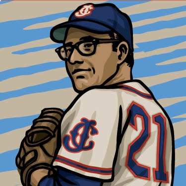
And below is the illustration I recently finished of Frankie Zak. He's more or less the reason I got into researching these odd-ball baseball characters many years ago and when I worked out my "line up" of players I wanted in my book, Frankie, of course, made the starting squad. Take a gander at the illustration, and if you're still interested, below it I'll tell you a little about the process of drawing the piece.

My original drawing of Frankie Zak, completed in what seems like a million years ago. Since he started out with the Tarboro Orioles and the a good part of the story dealt with how he started out in organized baseball, I depicted him with that minor league club. Now when I outlined my book, I wanted a chapter to be called "The Short Timers", guys who played only a short period but have a great story (you gotta see the new Moonlight Graham illustration I finishing up!). That meant I needed to show Zak on the Pirates, his major league team. No problem, big league teams are the most photographed and documented out of any sport in history. How hard would it be to accurately depict a 1944 Pittsburgh Pirates uniform? Turns out, much harder than could be imagined!
When I am working on my illustrations, I try to be as accurate as possible - I'm weird that way. I love the details of the old jerseys and caps, which I guess is why I have had a 25 year relationship will Will from Cooperstown Ballcap Company and now runs Ideal Cap Co., makers of the most accurate and beautiful caps in the universe. Since the 1980's Marc Okkonen's "Baseball Uniforms of the 20th Century" has been the go-to for anyone trying to accurately depict major league uniforms. It's a monumental and ground-breaking work, and as such, it has some flaws, and the 1944 Pirates is one of them. Here's what happened: The Pirates colors back then were medium blue and red. I know this by a documented Pirates jersey in the Hall of Fame from the summer of 1944. Ok. that was easy. Now for the cap. All reference shows a dark blue cap with a yellow "P". Since it's in the Okkonen book, anyone doing something with the mid-forties Pirates followed the guide. But the combo never made sense to me. yellow "P" with a navy cap coupled with the red and royal jersey? I dug deep. Looked at contemporary press photos and modern auction catalogues to find the truth. The old black & white photos show a slight difference in the colors of the brim and crown of the cap. Hmm. Ok. That's interesting can it be medium blue and red? The designer in me says yes, so I updated my drawing to a red and royal two-tone cap with a yellow "P". Looks kind of nice, but still I wanted to make sure I did this right. Then I found the Holy Grail - a bona-fide Honus Wagner cap from the 1944 season! It came up for auction a few years ago and has a rock-solid provenance to date it to 1944 - he kindly mailed it a Pittsburgh native who was serving in the Navy during the war. The sailor kept Wagner's letter in which he tells the Navy man that it is his own cap that he wore all summer - the summer of '44. The cap was beat to hell - the recipient was a lieutenant who saw much action in the Pacific, but it verified my suspicions that it was medium blue and red. The "P" was a yellow-ish hue so ok, I made my illustration with a yellow "P". But something didn't sit right with me, so I went back to the auction photos of the old cap and looked closely: the button on top of the cap, though worn, was obviously white. The "P", though appearing to be yellow, must have been discolored by being worn all summer and then being sent to a war zone. It was originally white.
I know, who cares, right? Well, I do. I can't stand it when artists can't take the time to properly research their subjects. The way I always go about my own work is that I try to be as realistic as I can always keeping in the back of my mind that someone may use my work as a guide for theirs. Plus, the research keeps me off the streets and out of trouble. And just for the record, I'm not faulting Okkonen's book and research in the least! It was an unbelievable undertaking and if I ever meet the man I'd like to buy him a drink or two to say thanks. He's a giant in baseball history and one of my favorite authors/researchers. Heck, his Federal League book makes my top 5 book list every time.
Anyway, hope you enjoy the drawing, Steve's article and a look under the hood of The Infinite Baseball Card Set!
Gary,,, you always amaze me with the research you do! Awesome. Can't wait for the new book.... Alan
ReplyDeletenice share, thanks
ReplyDeleteJual Emas Makassar
Jual Emas Depok